

Originally posted on 13 May 2013.
Among other things discovered this week, it turns out Instagram has a new logo. This came up while discussing the social media buttons on a forthcoming project.
“Hold on” I thought, “I’m pretty sure I don’t live under a rock, and should have noticed this!”
Well, it turned out I don’t live under a rock, just near a few, as the logo only just changed this week.
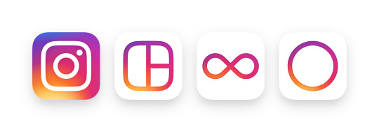
So, here are some Friday snaps of Instagram’s new logos.

If you want a plain old black and white version, the one from the Instagram blog looks the way to go:
![]()

Most of the mobile stuff used already the squiggly text logo, but the new multicoloured version can be seen in the app button, and favicons (or apple icons) as per your device, next time you upgrade your Instagram.
This upgrade is probably the result of an “app blindness” meeting at Facebook – there are too many apps using blue, and which therefore suffer from not being seen / clicked on. The screen real estate of your iphone is now up for grabs.
Think neon signs to get you on the app, and you’ll be somewhere near the mark.
What do you think? Like it or hate it?