

When dealing with clients new and old, in web design, our client, and the people who visit their websites, can usually fall into one of two categories: 1) those who have a favourite font (or fonts) they like in websites; and 2) those who don’t notice fonts… or don’t think they do.
When we ask “do you have any preference for fonts?” we usually find out whether the person fits into category 1 or category 2.
However, later, we often find that people do really have a preferred style of font, they just didn’t know it!
Table of Contents
How (Where) We Select Fonts
When selecting fonts, if we’re veering away from the standard, we like to use a good free repository which can be given to the browser at the time of first visiting (for a consistent feel). For this reason, we often select fonts from Google Web Fonts for projects.
There are other considerations, particularly for commercial font usage, which should be considered when selecting fonts, not least font licences. By utilising Google fonts, you steer clear of licencing issues ( and costs ) which are often placed upon commercial usages of proprietary fonts. This is not a licencing conversation – save it for the comments form 😉 – but for now, suffice to say, Google Fonts are an easy way to know you have licencing covered.
Lots of Fonts – For Lots of Purposes
A glance at the huge range of options there will tell you a couple of things:
- There are a LOT of freely available fonts, for all different styles and purposes;
- Bearing the above in mind, it makes sense to have a think about what style of font will suit your website!
Some websites can get away with a more fun style of font – for example if you are a children’s entertainer, you could use a more “comic” font – though, for businesses, a Times New Roman or similar font is often the way to go.
What We Use at Silicon Dales – and Why
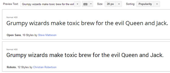
Because Silicon Dales is a “technology” website, we’ve gone for an open sans font (actually, we recently switched to this, as part of our continual development of this website), which we feel reflects the fact that we’re up with the times, professional, and, yet, don’t take ourselves too seriously. We want people to feel like they can approach us.
[UPDATE] we changed from Open Sans in 2016 to using another sans serif font, called Roboto Condensed. Initially we used two different “styles” of Roboto in the site (one for headings and one for paragraph text) but we were able to replicate the style using just one, and shave some time off the font loading size… another thing to consider… which is really optimal WordPress 🙂
Is this really something which comes across in a simple font?
Yes, it probably is.
But, maybe you’re in the “fonts don’t matter!” camp – leave a comment below. Do fonts mean anything to you on a website?