

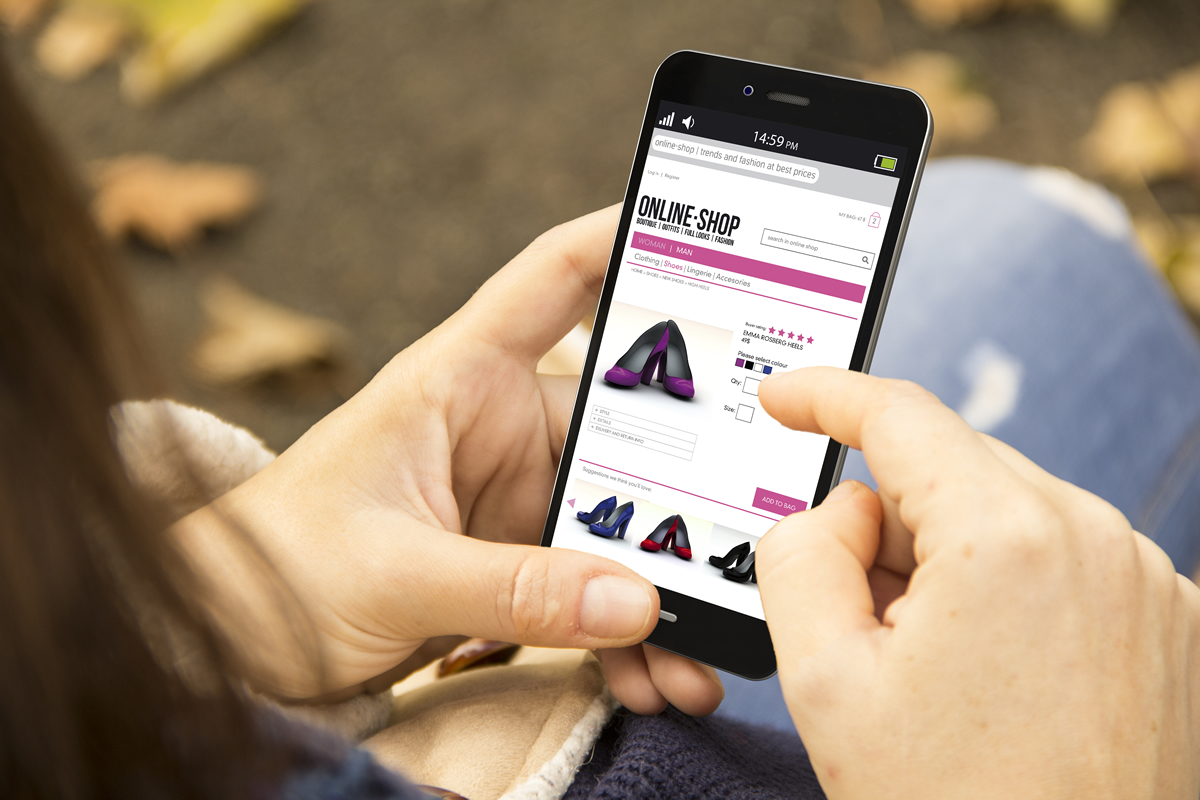
UX or User Experience in the context of online retail, means the ways an online store can be presented, laid-out and linked together to improve User Experience.
The most obvious example we usually give to clients is making the buy button bigger, brighter and “above the fold”. However, there are entire teams dedicated to UX and an industry around the science of improving usability on eCommerce websites. Things can get really granular down to the proven best wording for a button and the exact font size and ratios for different elements in a website.
It can help to bring some expertise in on these decisions, or skip the decisions and use a popular theme or platform where all these decisions will have been carefully combed over by experts.
Table of Contents
What Google Thinks
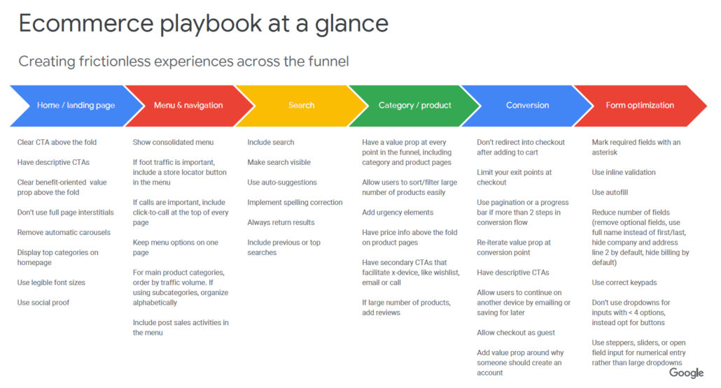

The Silicon Dales Guide to UX
Silicon Dales has our own take on UX, based on our mid-market experience with businesses in the US, UK, Australia and occasionally also Canada, Switzerland and the Nordic nations. In the handy hints below, we take our background with predominantly WordPress and WooCommerce, as well as the data and conversations to which we have access, to answer your questions and present UX advice in a way which speaks to our client base.
Home / landing page
The home page or landing page should be a great place to navigate from – it’s where users will go back to if they get lost. Even in a distraction-free checkout, there’s still a link back to the homepage, so it should the most useful page possible, bearing in mind your users.
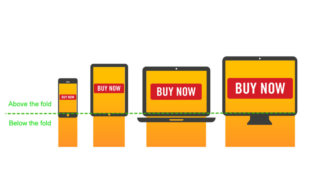
Clear CTA above the fold

Have descriptive CTA’s
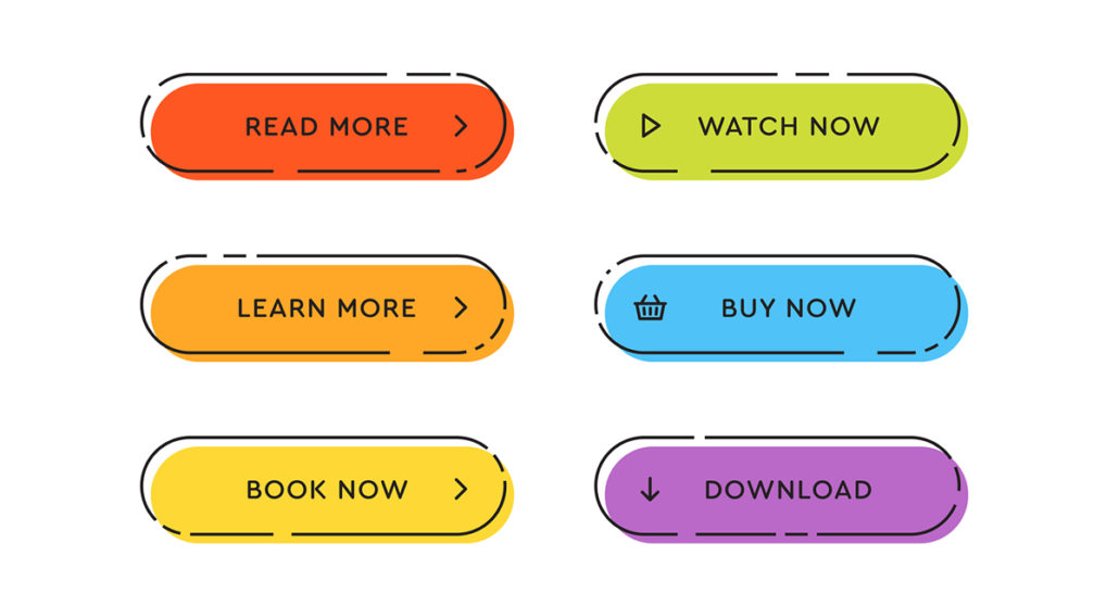
Try to be clear with your audience about what will happen when they click a button. Don’t be sneaky. Use standard phrases from buttons you see everywhere else: “Read More”, “Learn More”, “Book Now”, “Watch Now”, “Buy Now” and “Download”.
Clear benefit-oriented value props above the fold
Top value propositions would be things like same day delivery, collection tomorrow, “straight to your inbox”.
It’s worth thinking about how your product or service fulfils a need for your customers and thinking about the clearest and most direct way to communicate this.
Don’t use full page interstitials
Having said that, interstitials do assist conversion when used correctly and for an important announcement such as a closure or unavailability, they are a good way to ensure every user gets informed.
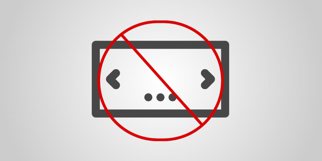
Remove automatic carousels

Display top categories on homepage
You’ll know your most popular categories from sales data, Google Analytics and other metrics. Don’t frustrate your users by insisting on listing all the categories alphabetically when you know everyone on your site is after the Zebra section! Pick a handful of top categories – as many as can be displayed comfortably and usefully. Help your biggest fans get where they want to be as quickly as possible.
Use legible font sizes
This will vary according to browsers – take a look at the advice here.
Use social proof
If someone has clicked on a link and now wants to buy a product, they are being (quite rightly) encouraged by every consumer group in the world to just make a few basic checks on the veracity of the website before getting out their credit card. One of the very simple ways you can earn the trust of your new customers about the products or services on your site – or even that the site is a genuine retailer – is to provide social proof by displaying reviews and community engagement. There are plenty of integrations aimed at providing this in a scalable way. Get in touch for our recommendations.
Menu & Navigation


Pick your most important and popular items for the menu – don’t worry about showing everything. It’s important that the menu is easy to use.
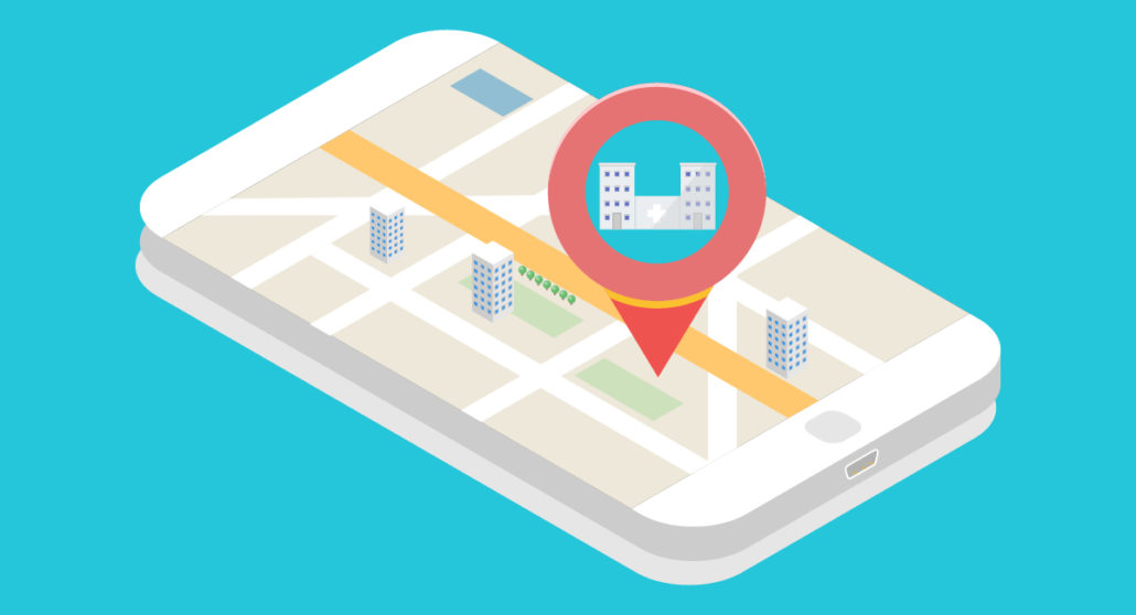
Store locator buttons
Click-to-call
Again, from a mobile-first point of view, make it easy to hop straight on a call (if that’s what you want users to do). For call-heavy businesses, put a click-to-call at the top of every page
Keep menu options on one page
Menu bloat is a sure-fire way to make a website unusable – especially on a smartphone. Keep the menu small enough to fit within the screen area.
For main product categories, order by traffic volume. If using sub-categories, organize alphabetically
The optimization only goes so far – give people what they want first, but then make everything else available in a traditionally organized way. Check your analytics to find the most visited categories and order them by popularity.
Include post sales activity in the menu
“Register” and “Sign In” are examples of post sales activity you might wish to include above the fold in the menu. Other post sales items include: customer service, exchanges & returns, and My Account pages.
Search


Include search
Make search available to all visitors to your online store, above the fold. It’s standard and a popular way for users to navigate.
Make search visible
A clear search icon next to the menu is the recommendation – especially for mobile.
Use auto-suggestions
Include both products and categories in the typing suggestions.
Implement spelling correction
Use auto-correct for common spelling mistakes.
Always return results
This means that even if someone searches for something you don’t have, there will be a useful page for them to continue with their search. Offer top categories or a featured sale to entice your visitor to keep looking and potentially make a sale.
Include previous or top searches
Under a “recently searched” heading, for example, include your visitor’s recent searches or popular searches from all users to make it as easy as possible to get to a useful page.
Category / Product
On the category and product pages, there are further specific recommendations for UX.
The Next example
Next are one of the major online clothing retailers in the UK, carrying inventory from other, additional, brands including Boden and Lipsy. They have a huge stock list and a busy website. Here’s how they’ve handled some of the important UX elements noted below:
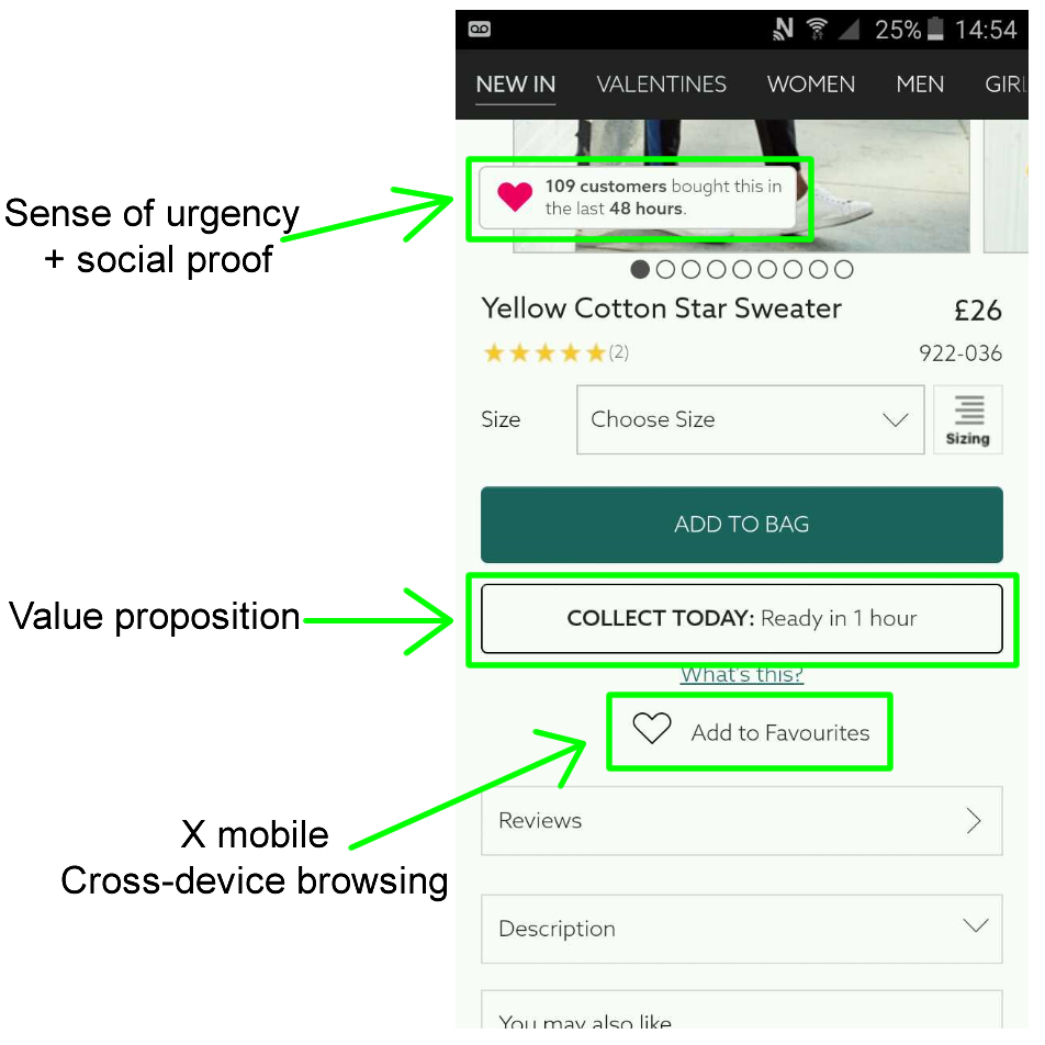

There are dynamically generated messages about recent purchases by other customers, which increases the sense of urgency, a clear value proposition “Collect today: Ready 1 hour” – which also adds to urgency, as well as a heart button “Add to favourites” which enables browsing users to save things they would like to look at later or on another device.
Have a value prop at every point in the funnel
An example might be “Free shipping on orders over $100 & free returns”. Put this everywhere in your custom journey – including category and product pages.
Allow users to sort/filter large number of products easily
Sort and filter are now becoming industry standard – they need to be in there if you have an online store. Many users love spending time looking through a large list of products in the right ballpark – make it as easy as possible with relevant filters such as colour or age group.
Add urgency elements
Have price info above the fold on product pages
The aim is to make a sale, so make sure the price is easily visible and enable your visitors to become customers as quickly as possible.
Secondary CTA’s
Make it possible for your users to buy in different ways, by creating secondary Call-to-Action’s – especially those which facilitate “X-Device” activity. A wishlist, email or call button are all good ways to achieve this.
If large number of products, add reviews
Reviews are a great way to build trust in the product and the service. They also provide unique user-generated content and often provide an alternative perspective on a product, which isn’t present in the product listing.
Conversion

A good way to measure conversion rates on a WooCommerce store, for example, is Google Analytics eCommerce tracking or Metorik. For help installing these, get in touch.
Don’t redirect into checkout after adding to cart
A popular request from our clients, redirecting to the checkout after the “add to cart” button is pressed is a slightly pushy way of ushering your customer on to payment. Instead, use a modal with options to allow users to stay on the product page, but still view their basket and choose whether to go to checkout.
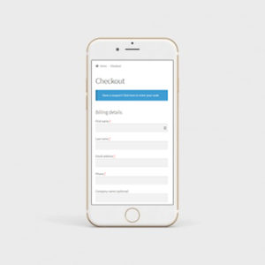
Limit your exit points at checkout
Also known as a “distraction free checkout” – take out the usual elements from your site and make sure that checkout is all about checking out. Consider removing the sidebar and even the footer and menu from this step.The only links should be homepage, back to cart or contact support – no menu in the part of the site.
Use pagination or a progress bar
If there are more than 2 steps in the conversion flow, consider adding pagination or a progress bar. Reassure users that the process won’t last forever and that they’re nearly finished. Typical labels on the steppers would be: “Address, Payment, Order review” or “Delivery, Details, Payment”.
Re-iterate value proposition at conversion point
This will usually be a free shipping or next day delivery banner, but could be something completely different such as “box of sparkles with every order”.
Have descriptive CTA’s
This means really clear button text which explicitly describes what happens next: “Choose Click & Collect” is a good example.
Allow user to continue on another device by emailing or saving for later
Users will often browse on a handheld device, but complete the checkout on a desktop or another device which has, for example, some saved payment details. Make it as easy as possible for users to have a seamless experience across devices by connecting through wishlists and saving for later in their inbox.
Let users sign up with social accounts
92% of users give up if they don’t remember a username or password. This also provides a great opportunity for social shopping and sharing after purchase.
For WooCommerce store owners, there’s a handy extension for social logins.
Allow checkout as guest
Google says that 35% of users will abandon the checkout if a retailer does not offer guest checkout.
Add value prop around why someone should create an account
Offer perks such as a faster checkout next time, a rewards program and wishlists.
Typing on mobile is hard. Make life easier for your users with these changes to your UX:
Mark required fields with an asterisk
This allows users to skip unnecessary steps.
Use inline validation
If the characters in the field don’t match what’s required – give a red error notice or tooltip helping your users correct their fields.
Use autofill
27% of users abandon orders due to a “too long / complicated checkout process”. Support browser assisted auto-fill and help get your users through checkout quicker.
Reduce number of fields
The best performing e-commerce sites have 6-8 fields, and a total of 12 form elements. The average retail checkout flow has 14.88 form fields. Here are some ways to achieve that:
- Remove optional fields
- Use full name instead of first/last
- Hide company and address line 2 by default
- Hide billing by default – use the “Shipping same as billing address” ticky box
Use correct keypads

Don’t use dropdowns
For inputs with fewer than 4 options, opt for radio buttons instead of dropdowns. Again, think mobile-first and try to make options as easy to select as possible on handheld devices.
Numerical entry
Make it as easy as possible to enter the correct number on a mobile. Use steppers, sliders, or open field input for numerical entry rather than large dropdowns.
Conclusions
Wow! That was a lot to digest, hey?! Let’s summarize the main takeaways from Google’s great big guide to UX, and incorporate these into our golden rules for eCommerce user experience:
- Make your most popular categories prominent
- Reduce fields in the checkout
- Include search with sort, filter and auto-complete
What Now?
Knowledge is great. You know what to build, and maybe, you know how too. If you’d like to book an agency who does all of the above (and more) as a part of it’s DNA, then contact us at Silicon Dales about developing or optimizing your online store for more organic traffic and sales conversions.
(Hint: the above button is a clear “Call to Action”)